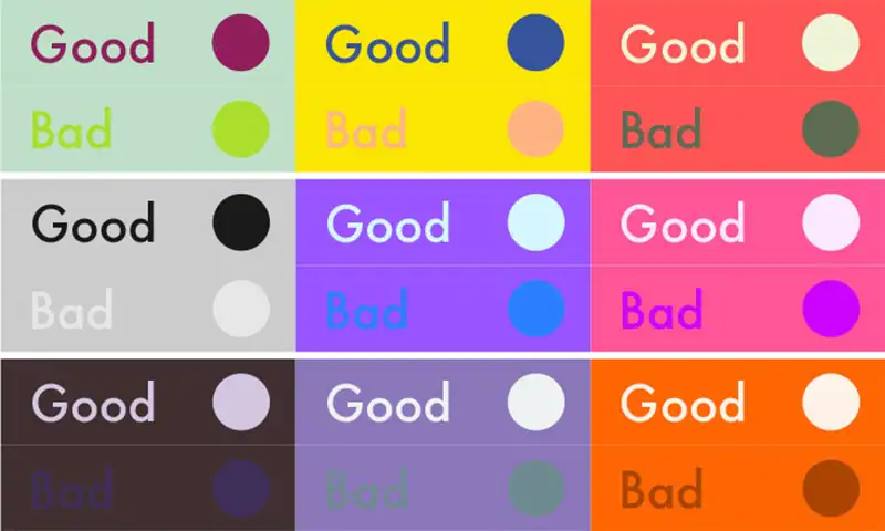
Color plays a significant role in design. When choosing colors for a specific design, it is imperative to check how each color looks in relation to each other. A high contrast design is legible and distinctive, and provides a better experience than a low contrast design. This is why black text on white is a standard practice, since it provides the best contrast, making the typography easily readable.
As illustrated in the following graphic, it is clear that color combinations with high contrast are much more easily readable, as compared to the low contrast ones, where the user needs to spend extra time to understand the text.
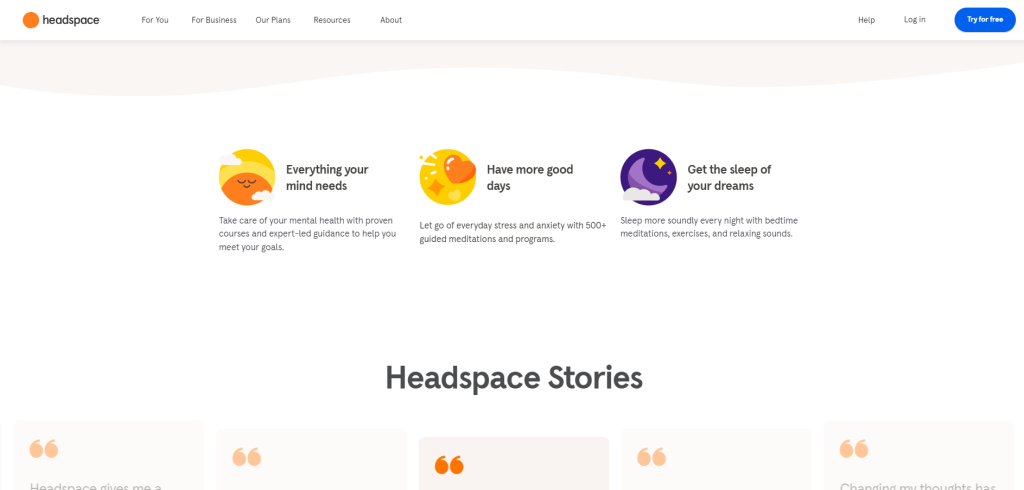
A thoughtful design is clean and uncluttered. It doesn’t overwhelm the user with excessive information, only providing enough information for a single step. All information is presented in a structured, organized manner, guiding the user through each step. Additionally, colors are carefully chosen and used, making sure that they do not feel overwhelming or aggressive.
The design of the Headspace website follows this principle, by being not only simple and uncluttered in terms of content, but also in using colors.
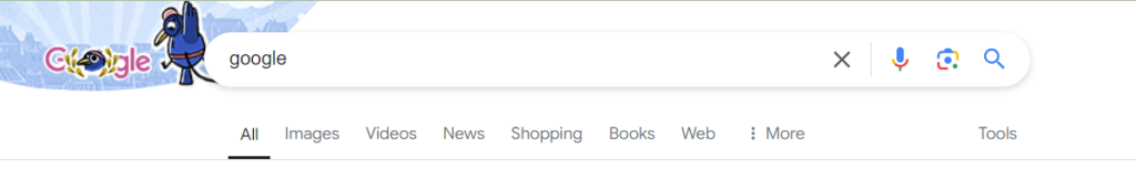
Arguably the most important aspect of a high quality UI design is the way information is presented to the user. This is best highlighted through the navigation menu visible on any website or application. Information is structured in a logical manner that follows a clear hierarchy, in terms of both steps to be followed, as well as relative importance. Navigation always has the Home or Dashboard as the very first link, followed by other links in decreasing order of importance.
Google’s search page has a clear menu at the top. Imagine the confusion if the All and Images links were somewhere later in the menu! We are conditioned to consider the first item in a menu as one with highest importance. If this order is not followed, it leads to confusion, which is not desirable.
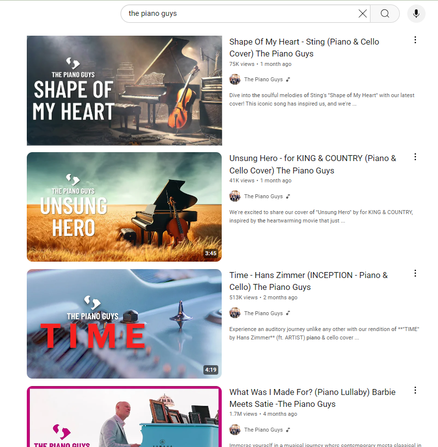
Following a set design for each element in a UI design builds a strong, consistent and easily recognizable interface. The search results on YouTube illustrate this perfectly: each item is consists of
This consistency means that a user can easily familiarize themselves with the interface, knowing what to expect each time they search for something. Giving users this sense of familiarity and ease will make them want to use your app again, since it will be easy and intuitive to use.
Imagine using an interface where you do not get any visual feedback when you click a button. Frustrating isn’t it? This is why it is important to design keeping responsiveness in mind. Every action generates some form of feedback, no matter how small. Hovering over a card changes the card’s appearance, hovering over a button makes it change color or size. A progress bar or a loading screen during a running process indicates to the user that their action has been recorded and is being processed.
All these examples are crucial for an engaging interface, where the user immediately sees the results of their interactions.